Firstly I started by planning different ideas for my final piece; they mainly consisted of larger scale drawings of different angles or parts of the face.
My first idea was to do three separate drawings of close ups to the face. These drawings would be incredibly detailed but still have the different aspects of the unfinished and experimental 'look' which would reflect both of my artists. They would be on A3 paper and be conducted in different medias; ne in pencil, one in biro, and one in charcoal sealed with water. This idea was inspired by the A1 large scale drawings in graphite and charcoal that I produced at the beginning of the year which I thoroughly enjoyed creating.
My second idea reflects and connects both of my artists very well, it involves drawings of different angles of different people's faces that will vary in age. The middle face would be detailed whilst the other two will be experimental with a 'sketchy' look; it would also be in pencil, and the other two faces in either biro or charcoal as these would be easier to manipulate and capture the experimental look that I want.
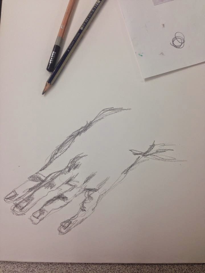
My Third involved hands to incorporate my experiments reflecting Egon Schiele's work as well as the profiles of the face which reflects both of my artists. Two different angles of the face would be used and hands in different positions would be place on and around the face; the hands would be representative of life, showing the control and pressures which creates and adds more layers to the piece.The materials used on this piece would be various graphite pencils, charcoal and fine liner, these would all be incorporated together to create a detailed yet expressive piece.
My fourth idea was to produce a simple yet detailed, large scale, tonal drawing of the face that combined and reflected both styles of my artists as well as doing what I love, drawing.The angle of the face would be unusual and reflect Powell's work as he tends to draw from unusual perspectives that accentuate different areas of the face. Whilst the simplicity of the piece reflects my other artist Tift, as he focuses on only drawing a portrait of a face in great detail. I then plan to add a tonal, yet expressive background to reflect work done throughout both of my sketchbooks and enhance the detail of the portrait; it will also tie the whole composition together.
I decided to produce my forth idea for my final piece as I felt it reflected both of my artists and suited my style the most.
When I produced practices of my final piece I experimented with scale, as originally I wanted to produce the piece on A1. However there was many difficulties as I found it hard to adapt my drawing style to a much larger scale, I found that as I increased the scale of the piece, it lost and lacked important detail and tone, which then made it feel messy. It was not up to the standard of quality that I wanted. Therefore, I decided to decrease the scale to A2 and produce quality instead of quantity.
Then I faced some difficulty with the background. With a simple tonal wash it looked unfinished, but then with an expressive background that included many tones, it took away the emphasis off the drawing and felt too much. I then found that if I created a expressive tonal background that was subtle, it brought balance to the piece.
Thursday, 22 January 2015
Tuesday, 6 January 2015
Experimenting with scale
At the start of the course I remember completing graphite drawing of a tree on A1 that was completely out of my comfort zone, however I really enjoyed doing it.
I have decided to start experimenting with drawing close up images of parts of people's faces. It has proven to be difficult as it is hard to get smooth darker tones in large areas; however I really enjoyed doing the two A3 drawings and I am going to continue experimenting with scale and developing and refining them.


I have decided to start experimenting with drawing close up images of parts of people's faces. It has proven to be difficult as it is hard to get smooth darker tones in large areas; however I really enjoyed doing the two A3 drawings and I am going to continue experimenting with scale and developing and refining them.
Close up of a man's eye and nose in various graphite pencils and fine liner.
Boy's mouth, finger and nose close up in various graphite pencils.
Experimenting with angles in photographed portaits
To add more variety into the primary sources I have chosen, I decided to experiment with looking different angles of the face to distort the traditional view of a portrait. This links to my artist Mark Powell, as he uses different angles of the face in his work.


Mono printing
Mono Printing is another transfer technique that involves either adding or taking away ink to create an image.
This is polystyrene printing and it creates a negative print; you create an dot work image in a piece of polystyrene and join up the lines to make your image. You then add the ink to the polystyrene with a roller and place it on an piece of paper and add pressure. When you remove the polystyrene, you will be left with a negative print of the image.


This is additive mono printing, which can be done in two ways; when the tile that you apply the ink to is dry it will leave you with a high contrast print, where as, if the tile was damp, it would create a tonal print that has a lower contrast.


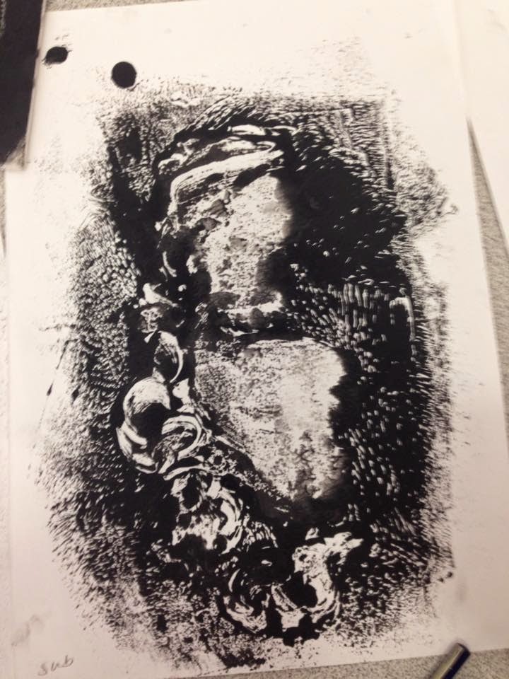 This is subtractive mono printing that involves taking away existing ink from a tile with either a dry or damp cloth to create a print; i found this type of mono printing the most difficult as it was harder to control, especially when using a damp cloth to subtract the ink.
Egon Schiele workshop and experiments
Egon Schiele was an artist
For those who do portraiture in the class, we had to focus on loosening up our existing skills and exploring new ones; to do this we looked at Schiele's work as it would enable us to do so.
The exercise consisted of us doing a continuous line drawing using various materials; such as pencil, biro, charcoal etc. And holding them by the ends. This then allowed us to apply less detail and precision to the drawings that we created.


 This technique just involved creating a simple continuous line drawing in pencil. The simplicity of this technique captured me and made me want to develop it further.

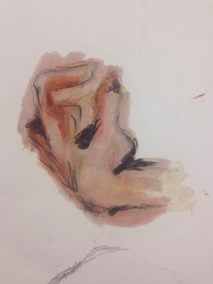 I have not developed these techniques as they did not seem to relate to my style and artists, and they did not interest me as much as the others. The first involved quickly sketching the image with a pencil and then applying different colour pastilles that related to the picture. A thinner was then added to blend the colours and spread them. I then added charcoal to contribute to the detail and the tone of the piece.
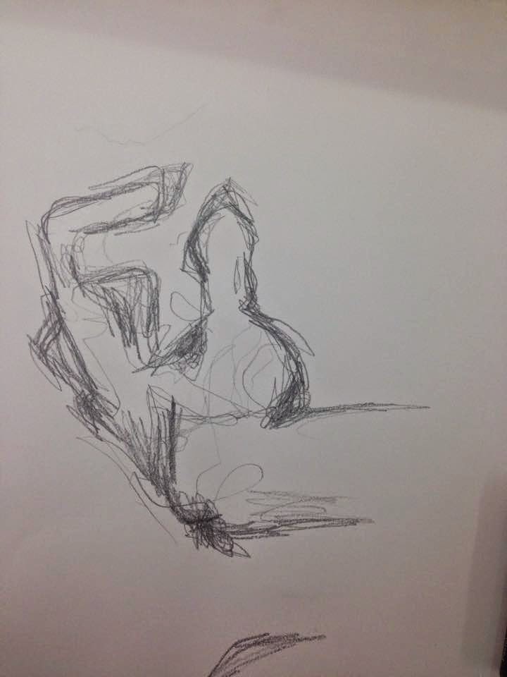
During the experiment, when I added the thinner to the piece, I discovered that the thinner had already been used and was not clear; this then added a light nude shade to the piece which I had to persevere with and use to my advantage. Adding the thinner also caused the piece to be seen from the other side, and whilst wet, it made the paper surrounding the piece translucent.

For those who do portraiture in the class, we had to focus on loosening up our existing skills and exploring new ones; to do this we looked at Schiele's work as it would enable us to do so.
The exercise consisted of us doing a continuous line drawing using various materials; such as pencil, biro, charcoal etc. And holding them by the ends. This then allowed us to apply less detail and precision to the drawings that we created.
For this experiment we used charcoal and sealed it with water. This spread the tone on the piece, which was difficult to control to start off with. However when I experimented with this technique again later on, I found that spread of tone can be used to your advantage, it is less time consuming and therefore cover areas in tone quicker and can be used effectively to create more layers.
This experiment involved a biro pen and hair spray; this simple technique creates a a blurred/smudged effect on the piece which creates more tone and marks. I thoroughly enjoyed this technique as it allowed you to keep adding layers of tone and detail.
When I continued this technique further on different studies of portraits, I found it more difficult to control when adding the hair spray as it would disperse the ink into areas where I did not want it to go. I quickly adapted my technique by spraying the hairspray on to my fingers and then applying it to the study; this created more precise smudging of the ink.
When I continued this technique further on different studies of portraits, I found it more difficult to control when adding the hair spray as it would disperse the ink into areas where I did not want it to go. I quickly adapted my technique by spraying the hairspray on to my fingers and then applying it to the study; this created more precise smudging of the ink.
This technique just involved creating a simple continuous line drawing in pencil. The simplicity of this technique captured me and made me want to develop it further.I have not developed these techniques as they did not seem to relate to my style and artists, and they did not interest me as much as the others. The first involved quickly sketching the image with a pencil and then applying different colour pastilles that related to the picture. A thinner was then added to blend the colours and spread them. I then added charcoal to contribute to the detail and the tone of the piece.During the experiment, when I added the thinner to the piece, I discovered that the thinner had already been used and was not clear; this then added a light nude shade to the piece which I had to persevere with and use to my advantage. Adding the thinner also caused the piece to be seen from the other side, and whilst wet, it made the paper surrounding the piece translucent.
This experiment involved using the some of the techniques we had previously discovered, all together on an white matt emulsion background. The image was quickly sketched in charcoal and coloured pastilles were then added, this was then blended with thinner and the charcoal was sealed with water. This piece could be improved in many ways, however I found it difficult to balance all of the mediums, as they all disturbed one another when applying and blending them. If I repeated this technique, I would take more care in finding the correct balance of materials and choose a better composition.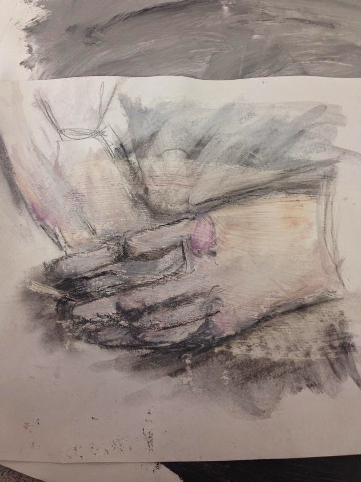
Subscribe to:
Comments (Atom)